GOCCIA
Goccia is the first magazine for Communication Design’s course made by and for students. It is a project with an independent and multi-disciplinar approach which tries to represent the intellectual vivacity of our course and the discipline in general. The focal point of the entire project is a periodical theme which is developed transmedially in all the artifact system of Goccia: a physical copy of the magazine and a digital touchpoint in which the the theme is furthermore explored. Goccia's meta-projectual core is constitued by values such as his “democratic nature, customization and immediacy”. These value are incarnated in featueres like the participation and interaction with users and the observational approach by which the theme is selected.. The whole identity is based on the concept of fluid which sort of incorporates all the other values. We could resume Goccia as an attempt to catch and represent through the Politecnico community the Graphic Design's zeitgeist, periodically.
The identity consists in few key elements: name, logo, payoff, main font. The name Goccia refers to “bosco La Goccia” an abandoned ex-industrial area, now contamined by nature. In this case the name Goccia, meaning “Drop”, is a reference also to the fluid identity and approach of the magazine and to his capacity of “being contaminated” in the same way the physical place has been contaminated by plants. The logo, smooth and also fluid, is made only by a capital G coming from the experimental open-source font Pilowlava designed by Velvetyne typography. With its simplicity it allows various declinations or “contaminations”. The payoff re-proposes the concept of fluidity in an explicit manner. Ending the indentity section, there is Monument Extended (by Pangram Pangram), the only fixed font for all the artifacts system. In fact elements like typography, colour or texture are not fixed, but vary in relation to the theme. The addition of other fonts for instance has to be conducted coherently with the theme of each number of Goccia, inside each semestral publication. Each theme is the result of an observation on main social platforms of the latest graphic tendencies. Then the redaction selects a keyword representing better the underlying theoresis of the tendency, its speculative core. In this case, observing the latest wide-spreaded half-robotics half-human graphics, the keyword that came out from the dialogue was "post-human". We talk about a tendency which has its artistic origin in ’70 and ‘80 sci-fi movies and especially in a ’90 contemporary art movement.
We divided the magazine in three sections. The first shows curatorial contents like an historical Background, interviews to emerging designers and artists, technical focuses on typography related to the theme. I wrote down the Background part, which represents the cultural and artistic development of the theme. For example I have not limited its origin in well-known sci-fi movies and novels like Asimov’s ones. The goal was to go deeper in the speculation, showing links to humanistic art and post-renaissance artists like Hieronymus Bosch. Then in the other articles there is certainly a more contemporary-oriented focus. The core of the magazine is a sequence of the personal redaction members’ interpretation of the theme. That is carried out in a multi-disciplinar manner as each member of the redaction tries to give out his personal free-form interpretation. So we made both the container and the content. Mine is “Scenari Post-Ludici”, a photographic and graphic artifact which reflect of the way we approach playing latest video games and the influence of competitiveness (e-sports) on it. We tried to expand the borders of contribution with an entire section dedicated to user-generated contents. The last section is in fact a collection of all the contributions that have been sent to us by design students of Politecnico di Milano. They’re all interpretations of the theme but this time without a comment which gives them a conceptual coherence. In this way every design enthusiast can use our zine as a showcase for his work, while we benefit of their interest which generates awareness the brand through partecipation.
The non-fixed identity of the magazine consists in a variation of few visual features. For instance, in the cover, there is always the logo overlying a thematic texture. The logo always interacts with the texture. In the case of Goccia #00 (Post-human) the logo has been rendered in wireframe on an organic texture, representing the interaction of technology and biology in the Post-human speculation and visual tendency. In the cover beside there the logo interacts with a tropical leaf in the number #01 (not entirely designed) with the theme of “Exotic”. In the image below there is an example of the declination of the internal graphic features, specifically the ones of “Flusso” middle section. The progression and interaction of images and text is fixed but colour, background texture and typography vary from the #00 number.
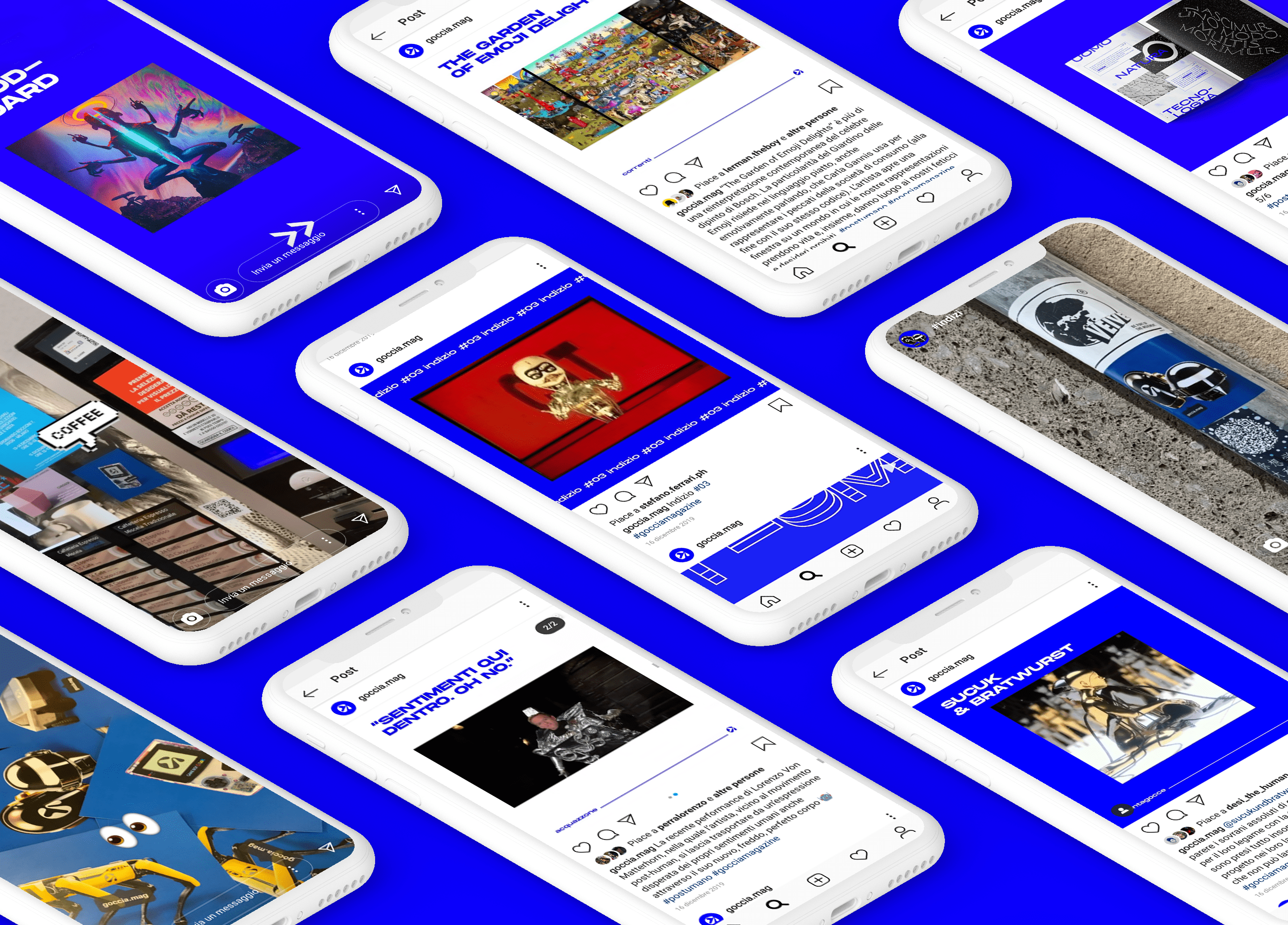
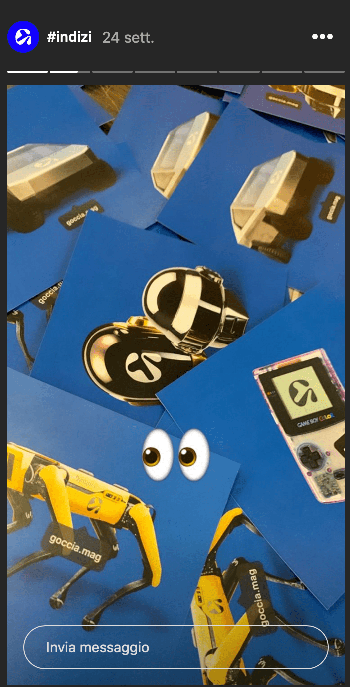
@goccia.mag on Instagram is not only a touchpoint with the audience. It is a trans-medial editorial space which brings furthermore the narration of the magazine. The tone-of-voice of all copywriting is ironical and engaging. We determined various formats like “Indizi” to give indications of the next theme and to generate curiosity in it. That in particular is combined with a guerrilla marketing action with stickers of the “Indizio” spread around the whole campus. We make interaction with the audience reposting the ones that finds the sticker. Other formats like “Contagocce”, following the publication, expand directly the contents of the printed copy of the magazine. Instagram profile is also a platform which permits, with its in-evidence stories, the spreading of our brief for user’s contribution. It provides them with a moodboard and an explicit definition of what the current number is going to talk about.